Balance
Now besides talking about sustainability, lets also look at the concept of Principles of Design that helps us in creating and developing attractive and aesthetically pleasing compositions. The very first and most fundamental Principle of Design is- Balance. So let's try to understand balance and types of balance in detail now!
Balance is the distribution of the visual weight of objects, colors, texture and space. Balancing a composition involves arranging both positive elements and negative space in such a way that no one area of the design overpowers other areas. Everything works together and fits together in a seamless whole. This balance can be achieved by dividing the weight into two ways- Symmetrical Balance and Asymmetrical Balance. Symmetrical balance is mirror image balance, in this the elements used on one side of the design are similar to those on the other side. On the other hand, in Asymmetrical Balance both the sides don't appear to be identical even though they are balanced. Asymmetrical balance can be used when one wishes to achieve a more casual or less planned look and feel. An asymmetrical composition can create a sense of tension as if the page or screen may tip or things might slide off the side.
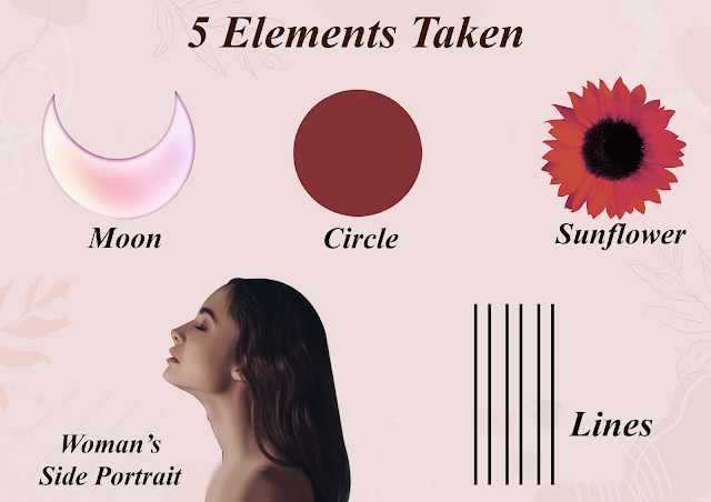
Once, I understood this principle, now was the time to apply it. So here, for a better understanding I have tried to create one Symmetrical and Asymmetrical composition using 5 main elements. Let's have a look at them.
Symmetrical Composition
Assymetrical Composition
For Asymmetrical composition, I have tried to balance the same elements by changing the value of circles on the right hand side. And also by dividing and balancing the visual weight of the sunflower placed in the hairs of the girl. I have also flipped the whole composition vertically on the left to make it look more asymmetrical yet balanced in nature. One can also notice how the value of sunflowers is comparatively low on the left hand side of the composition.References-
Anon., n.d. Top png. [Online]
Available at: https://kawa11-k1tt1es.tumblr.com/post/132454441195
[Accessed 8 November 2020].
Anon., n.d. Tumblr. [Online]
Available at: https://kawa11-k1tt1es.tumblr.com/post/132454441195
[Accessed 8 November 2020].


Comments
Post a Comment