Posts

Harmony

Image
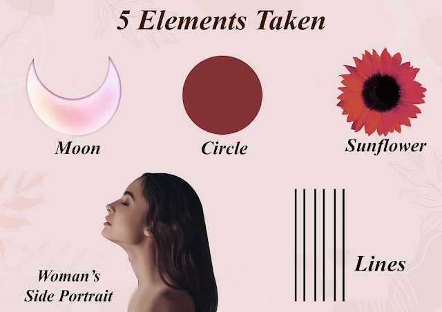
You know the drill. I'll be now taking about another fundamental Principal of Design which is Harmony. I find this aspect the most interesting since it's all about achieving coherence. Harmony is basically a visually satisfying effect of combining similar or related elements. And to show you the closest example of Harmony, I have tried an Installation art this time. For those of you who don't know, Installation art refers to a large scale, mix media construction, which is often designed for a specific place or for a temporary period of time. Sounds interesting right? Let's have a look at it then! For any design here has to be an inspiration, a story or a good concept behind it. And similarly, for my Installation art, I wanted to display the concept of 'Dual Personality ' through Abstract art . I wanted to show the contrast in our personalities, where one side of our personality is what we show to everyone and the other part is which we try to hide from the socie

Emphasis And Contrast

Image
 Now let's move forward and look at  other Principles of Design, which are Emphasis and Contrast. Emphasis is a strategy that aims to draw the viewer’s attention to a specific design element. The emphasis part of a composition is the one that stands out the most or appears closest to you. While Contrast, occurs when two or more visual elements in a composition are different.  In visual perception of the real world, contrast is determined by the difference in the color and brightness of the object and other objects within the same field of view. Both these Principles are very important aspect for any design, but they are most important in the field of Photography. And in order to display that, I have attempted several compositions using 4 main grids of photography. These grids are- Golden Spiral, Golden Grid, Pyramidal and last but not the least- Rule of Third. Keeping these grids in mind one can get some aesthetically pleasing and balanced pictures, so let's look at what I have

Rhythm

Image
 After Balance, second important Principle of Design is Rhythm. Rhythm refers to a regular repeated pattern of sound or movement. In art, however, it refers to the relationship between elements that come together to create a sense of harmony. Best example for Rhythm in art is Tesselation. Tesselation is  created when a shape is repeated over and over again covering a plane without any gaps or overlaps. In a tesselation, background and foreground have equal meaning. When combined together, these both principles can give us some amazing compositions. For the better understanding of it, let's look at what I  have tried! Getting inspired from African masks and their intricate details, I decided to develop a motif which represents them. For the same I developed the shapes in a way that fit together like a puzzle. I have tried to add as many details I could using software's like Photoshop and Illustrator. Then using a triangular grid, and following the concept of tesselation and Rhyt

Recreating A Garment

Image
Now this is going to be an interesting post. As the name suggests this blog will be about a garment that I have recreated keeping the concept of 3R's in my mind.  The main motive of this blog is to show how we can repurpose or upcycle the garments that we or our family and friends no longer wear. All that is needed to recreate a garment is 1tbsp of creativity and an unused garment. So let's get started and look at what I have tried to recreate here. Also, to make this post more interesting, I have tried to keep my visuals interesting. So, the first step towards recreation was obviously about picking a garment. For this, I decided to go with my brother's old shirt that he no longer wears. With this shirt I was hoping and planning to make something for myself. As my second step I took out a panel from shirt according to the length of the top that I was planning to make.  Well, can you think of the direction I am going in? If you think long enough you'll find so many desig

Eco- Friendly Fashion Solutions

Image
As you know, I've been mostly talking about the problems associated with the fashion industry. But I am sure all of you must be eager to know the solutions and alternatives too. So, lets focus on the solutions of these problems today. Let's discuss what are the alternatives that we can turn to in this world of fast fashion. Let's get started! I'll first start off by discussing the alternatives to the fast fashion.  As the fashion industry is moving forward together to achieve sustainable goals, there are a few fashion champions who don’t believe in contributing to the already cluttered fashion industry. Instead, they want to focus on the importance of recreating and repurposing products that are already floating in the system. When others are busy sketching out their designs in their studio, these designers are responsibly collecting their own fabric waste, visiting export houses and factories, picking up discarded fabric samples, stray embellishments and all the produc

Understanding The Problems of Fashion

Image
Most of my blogs have revolved around the concept of sustainability. I have constantly been mentioning how fast fashion is impacting our environment and what are the many options available to us. However, let's look at some more aspects of fast fashion and environmental degradation. Let's look one last time and understand the problems associated with fast fashion. So, without wasting any more time, let's get started! I am sure most of you by now are aware of the fact that Fashion is the second most polluting industry in the world. But have you yet acknowledged that problem? Have you taken any steps to tackle the problem? If your answer is 'NO' then take a look at this video which gives you a short preview of all the effects of the global fashion production. It clearly projects the seriousness of the issues we are dealing with in the industry whose 80% of production is doomed for landfills.  I am sure after watching this video, many of you might have been able to und

Balance

Image
Now besides talking about sustainability, lets also look at the concept of Principles of Design that helps us in creating and developing attractive and aesthetically pleasing compositions. The very first and most fundamental Principle of Design is- Balance. So let's try to understand balance and types of balance in detail now! Balance is the distribution of the visual weight of objects, colors, texture and space. Balancing a composition   involves  arranging both positive elements and negative space  in such a way that no one area of the design overpowers other areas. Everything works together and fits together in a seamless whole. This balance can be achieved by dividing the weight into two ways- Symmetrical Balance and Asymmetrical Balance.  Symmetrical balance is mirror image balance, in this the elements used on one side of the design are similar to those on the other side. On the other hand, in Asymmetrical Balance both the sides don't appear to be identical even though th